import sys; sys.path.insert(0, "python")
import numpy as np
import matplotlib.pyplot as plt
import accel_integration as ai
%matplotlib inline

NAIVE, CORR, FREQ = "#D8473C", "#1F9D6B", "#C24BE0"
MEAS, CLEAN = "#6B4CF0", "#5B5B6B"
plt.rcParams.update({"font.size": 10, "axes.grid": True, "grid.alpha": 0.3})Signal processing: acceleration → velocity → displacement
MODULE 03 · SIGNAL PROCESSING
The accelerometer is the workhorse SHM sensor, but the quantities engineers act on — drift, peak displacement, residual offset — live at the displacement level. Getting there means integrating \(a(t)\) twice. That is trivial arithmetic and almost always wrong on real data: any DC offset or low-frequency noise integrates into a runaway baseline. A constant bias \(b\) becomes a velocity ramp \(b\,t\) and a displacement parabola \(\tfrac{1}{2} b\,t^2\).
\[ v(t) = \int_0^t a(\tau)\,d\tau, \qquad u(t) = \int_0^t v(\tau)\,d\tau . \]
In the frequency domain, integration is division by \(i\omega\), so it amplifies exactly the low frequencies instruments measure worst:
\[ V(f) = \frac{A(f)}{i\,2\pi f}, \qquad U(f) = \frac{-A(f)}{(2\pi f)^2}. \]
The fix used in earthquake/SHM practice is baseline correction + high-pass filtering. All computations below come from python/accel_integration.py.
A. The integrator is correct
First, prove the numerical method on a damped single-degree-of-freedom system whose velocity and displacement are known in closed form.
t, a, v_ex, u_ex, u0, v0 = ai.sdof_free_vibration()
dt = t[1] - t[0]
v = ai.integrate(a, dt, initial=v0)
u = ai.integrate(v, dt, initial=u0)

fig, ax = plt.subplots(2, 1, figsize=(8, 4.5), sharex=True)
ax[0].plot(t, v_ex, color=CLEAN, lw=3, alpha=.5, label="analytic")
ax[0].plot(t, v, "--", color=CORR, label="cumtrapz")
ax[0].set_ylabel("v  [m/s]"); ax[0].legend(loc="upper right")
ax[1].plot(t, u_ex, color=CLEAN, lw=3, alpha=.5, label="analytic")
ax[1].plot(t, u, "--", color=CORR, label="cumtrapz ×2")
ax[1].set_ylabel("u  [m]"); ax[1].set_xlabel("time  [s]")
plt.tight_layout(); plt.show()

print(f"max velocity error     {np.max(np.abs(v-v_ex)):.2e} m/s")
print(f"max displacement error {np.max(np.abs(u-u_ex)):.2e} m")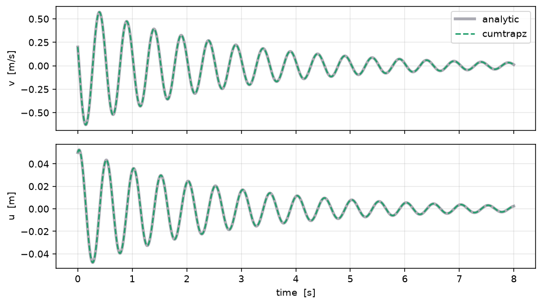
max velocity error     4.17e-05 m/s
max displacement error 7.31e-05 m
The errors are ~\(10^{-4}\): the method is exact. The trouble in real data is the data, not the maths.
B. The drift trap
Now corrupt a clean rest-to-rest pulse with a 1% DC bias, slow drift, and noise — what an uncalibrated sensor produces — and integrate it naively vs. corrected.
t, a_clean = ai.rest_to_rest_wavelet()
dt = t[1] - t[0]
_, u_true = ai.acc_to_motion_naive(a_clean, dt)

rng = np.random.default_rng(0)
pk = np.max(np.abs(a_clean))
a_meas = a_clean + 0.01*pk + 0.02*pk*np.sin(2*np.pi*0.05*t) + 0.02*pk*rng.standard_normal(len(t))
v_nai, u_nai = ai.acc_to_motion_naive(a_meas, dt)
v_cor, u_cor = ai.acc_to_motion_corrected(a_meas, dt, fc=0.10)

fig, ax = plt.subplots(2, 1, figsize=(8, 4.8), sharex=True)
ax[0].plot(t, a_clean, color=CLEAN, label="clean")
ax[0].plot(t, a_meas, color=MEAS, lw=.8, alpha=.7, label="measured")
ax[0].set_ylabel("a  [m/s²]"); ax[0].legend(loc="upper right")
ax[1].plot(t, u_true*100, color=CLEAN, lw=3, alpha=.5, label="true")
ax[1].plot(t, u_nai*100, color=NAIVE, label="naive (drifts)")
ax[1].plot(t, u_cor*100, "--", color=CORR, label="corrected")
ax[1].set_ylabel("u  [cm]"); ax[1].set_xlabel("time  [s]"); ax[1].legend(loc="upper left")
plt.tight_layout(); plt.show()

print(f"peak |u| true      {np.max(np.abs(u_true))*100:6.2f} cm")
print(f"peak |u| naive     {np.max(np.abs(u_nai))*100:6.2f} cm")
print(f"peak |u| corrected {np.max(np.abs(u_cor))*100:6.2f} cm")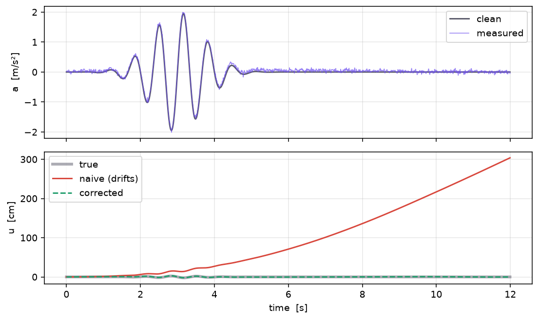
peak |u| true        2.35 cm
peak |u| naive     303.66 cm
peak |u| corrected   2.79 cm
C. A real record — 1940 El Centro NS
t, a, dt = ai.load_elcentro("resources/data/elcentro_ns_g.txt")
v_cor, u_cor = ai.acc_to_motion_corrected(a, dt, fc=0.10)
v_fd, u_fd = ai.acc_to_motion_freqdomain(a, dt, f_lo=0.10)
_, u_raw = ai.acc_to_motion_naive(a + 0.002*ai.G, dt)   # +2 mg raw-sensor offset

fig, ax = plt.subplots(3, 1, figsize=(9, 6.5), sharex=True)
ax[0].plot(t, a, color=MEAS); ax[0].set_ylabel("a  [m/s²]")
ax[0].set_title(f"PGA = {np.max(np.abs(a))/ai.G:.3f} g", loc="left", fontsize=10)
ax[1].plot(t, v_cor*100, color=CORR, label="corrected (0.1 Hz HP)")
ax[1].plot(t, v_fd*100, "--", color=FREQ, alpha=.8, label="frequency domain")
ax[1].set_ylabel("v  [cm/s]"); ax[1].legend(loc="upper right", fontsize=8)
ax[2].plot(t, u_raw*100, color=NAIVE, label="naive, +2 mg bias (runaway)")
ax[2].plot(t, u_cor*100, color=CORR, label="corrected")
ax[2].set_ylabel("u  [cm]"); ax[2].set_xlabel("time  [s]"); ax[2].legend(loc="upper left", fontsize=8)
plt.tight_layout(); plt.show()

print(f"PGV corrected {np.max(np.abs(v_cor))*100:5.1f} cm/s   PGD corrected {np.max(np.abs(u_cor))*100:5.1f} cm")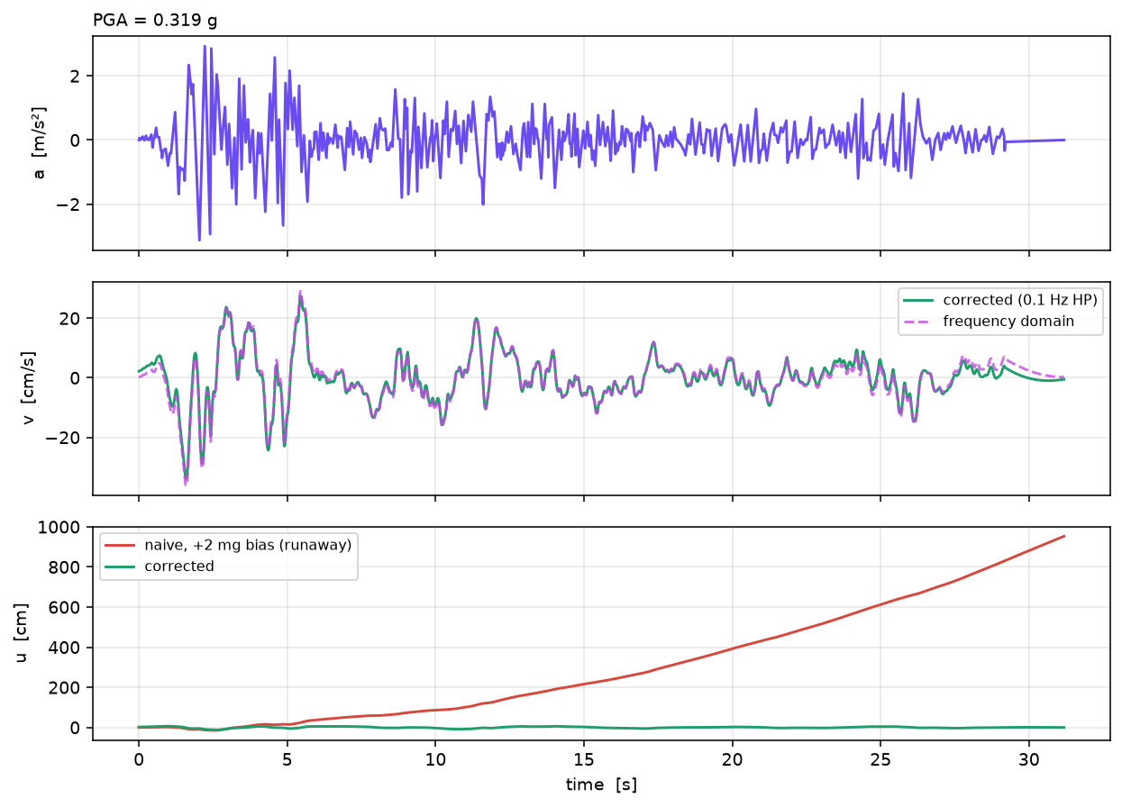
PGV corrected 33.8 cm/s PGD corrected 12.5 cm
Tip
Explore this interactively — vary the sensor bias and high-pass corner — in the acceleration → displacement demo. Every curve there is computed by this same Python; the page only draws it.